Kickoff meetings make building a cohesive icon system sound easy. Three months later, it’s a nightmare. You start with a free open-source pack, realize the specific “dashboard settings” glyph is missing, and suddenly you are mixing line weights. Custom assets start sticking out like sore thumbs.
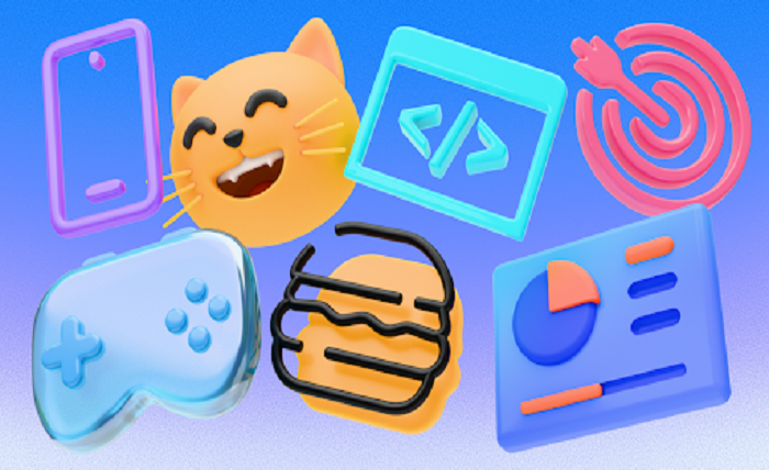
Icons8 attempts to solve this fragmentation. It isn’t just a search engine for graphics; it provides standardized style libraries. With over 1.4 million icons and 45+ distinct visual styles, the platform acts like an outsourced design team. The goal is ensuring your “user profile” icon in the settings menu matches the visual weight of the “cart” icon in the header.
The Architecture of Consistency
Strict adherence to style guidelines defines the platform. Unlike aggregators that flood you with uploads from thousands of designers with varying standards, Icons8 keeps control centralized.
Building an iOS app requires more than just “an outline icon.” You need assets following Apple’s specific stroke width and corner radius guidelines. Icons8 stocks over 30,000 icons built specifically for iOS 17 (in Outlined, Filled, and Glyph variations). Windows 11 gets 17,000+ tailored assets. Material Outlined has over 5,000.
Product teams can adopt a specific visual language-whether it’s the clean lines of “Office” style or the playful depth of “3D Fluency”-and find almost any metaphor in that exact style. You aren’t just downloading an asset. You are subscribing to a design system.
Workflow Scenarios
Seeing the library in production environments clarifies where this tool fits.
Scenario 1: The UI Designer in Figma
Take a product designer tasked with refreshing a legacy SaaS platform. Stakeholders want a modern “glassmorphism” aesthetic but lack the budget for custom 3D illustration. The designer installs the Icons8 Figma plugin.
Browsing the website isn’t necessary. They stay on the canvas. Selecting the “Liquid Glass” style matches the new direction. As they build out the sidebar navigation, they drag icons directly into frames.
Then the “Analytics” icon clashes with the company’s purple branding. Opening Illustrator is a waste of time. The designer uses the plugin’s recoloring tool to map the icon’s primary colors to the brand’s hex codes before insertion. Visual language remains consistent across 50+ screens without drawing a single vector path.
Scenario 2: The Frontend Developer and the Missing Asset
Now, a developer building a React-based dashboard. The design team handed off the project weeks ago, but a new requirement just landed: add a “dark mode” toggle. The original icon set didn’t include a sun/moon glyph.
Waiting two days for a designer to create one kills momentum. The developer hits the Icons8 site instead. They search for “moon” and filter by the style used in the rest of the app (e.g., Material Outlined). Finding the right match, they use the in-browser editor to adjust padding so it aligns perfectly with existing buttons. They check the “Simplified SVG” option to ensure the code is clean, copy the SVG, and paste it into the component. Problem solved in three minutes with zero design debt.
A Narrative Example: The Marketing Sprint
Picture a content manager working on a slide deck for a quarterly review. The deadline is tight. Generic clipart looks amateur.
She opens the Pichon app (the Icons8 Mac client) which floats over her presentation software. She needs to visualize “growth” and “community.” Selecting the “Hand Drawn” style keeps the tone friendly. A rising graph icon lands on her slide.
One catch: it’s black, but the slide background is dark navy.
She clicks the icon in Pichon, selects the color picker, and chooses white. The asset updates instantly. She drags it back in. Next, she needs something more expressive for a slide about user sentiment. Switching categories, she finds a set of emojis that match the hand-drawn aesthetic rather than the standard yellow faces. She drops them in. The presentation looks like a bespoke agency illustrated it.
Beyond Static Assets
Static UI elements are the foundation, but the library extends into interactive and motion design. Developers looking to add micro-interactions-like a ringing bell for notifications or a hamburger menu that morphs into an “X”-have access to over 4,500 animated icons.
These aren’t just GIFs. You can download them as Lottie JSON files. This ensures smooth, scalable rendering on mobile and web without the pixelation artifacts of raster formats. Video editors can even grab After Effects project files to tweak animations at the keyframe level for promotional videos.
Comparison with Alternatives
Open Source Sets (Feather, Heroicons)
Libraries like Feather are fantastic for their price (free) and code quality. But they are incredibly small, usually containing 200-300 icons. They cover the basics. The moment you need a specific icon like “cricket bat” or “biohazard,” you hit a wall. Icons8 works best when you need depth that open source cannot provide.
The Noun Project
The Noun Project has massive variety, perhaps even more than Icons8 in terms of sheer concepts. But it is an aggregation of different authors. Finding 50 icons that look like they belong to the same family is difficult. Icons8 prioritizes “pack” consistency over individual artistic expression.
In-House Design
Building your own set offers maximum control. But maintaining it is expensive. Drawing, exporting, and managing 10,000 icons to cover every possible use case usually costs more in man-hours than a subscription does in dollars.
Limitations and When to Look Elsewhere
The SVG Paywall
The most significant friction point for new users is the format restriction. The free tier allows PNG downloads up to 100px. Modern web development or high-resolution print requires more. If you need vector (SVG) files for responsive scaling, you must upgrade to a paid plan.
Attribution Requirements
Staying on the free plan means linking back to Icons8. For internal tools or student projects, this is fine. For a white-labeled commercial product, it looks unprofessional, effectively forcing the upgrade.
Style Lock-in
Having 10,000 icons in a style is great, but you are locked into Icons8’s interpretation. If you love the “Plumpy” style but hate how they drew the “email” icon, your options are manual editing (using Lunacy or Illustrator) or requesting a change.
Practical Tips for Power Users
- Use Collections for Bulk Actions: Don’t download icons one by one. Drag everything you need for a project into a “Collection.” You can then recolor the entire set in one click and download them as a font or a sprite sheet.
- The Request Feature is Real: Missing a specific icon? Submit a request. It requires community votes (8 likes) to enter production, but the team actually fulfills these requests to fill gaps in popular packs.
- Check “Simplified SVG”: When downloading SVGs for web use, ensure the “Simplified” checkbox is ticked. This removes unnecessary metadata and merges paths, resulting in a smaller file size and cleaner code.
- Recolor Before Download: Even if you have design software, use the site’s “Recolor” feature to apply your brand hex code. Ensuring every asset is compliant before download saves a step in your editor.
Icons8 acts less like a creative playground and more like utility infrastructure. It trades the unique flair of bespoke illustration for the reliability of a massive, standardized manufacturing plant. For most product teams, that is a trade worth making.